Watch Winders
A luxury watch store, designed from scratch around the customer experience.

A watch dealer, 319 watches, and a basic online store
watchwinders.pk sells authentic luxury watches in Pakistan. I designed the full store experience from scratch, from browsing and product discovery to product pages and checkout, then built it on Shopify, replacing the old WooCommerce store.
The old store made every sale a conversation
Four things stood between a visitor and a purchase.
- 01
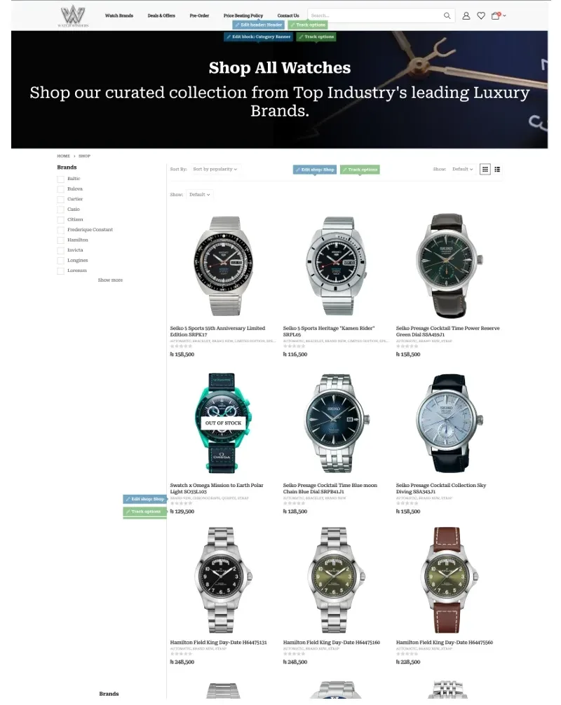
A big catalogue, one flat list
319 watches in a single grid, with sold-out pieces mixed in.
- 02
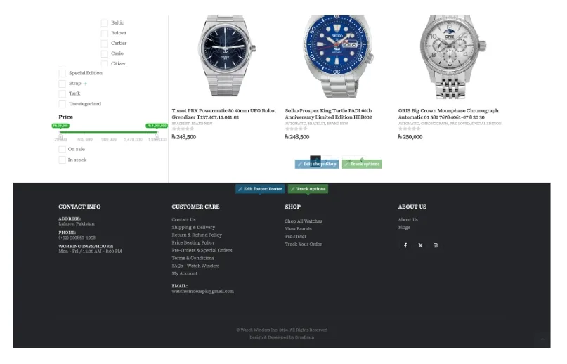
23 brands, no way in
A logo wall still showing template placeholders, and no brand pages behind it.

- 03
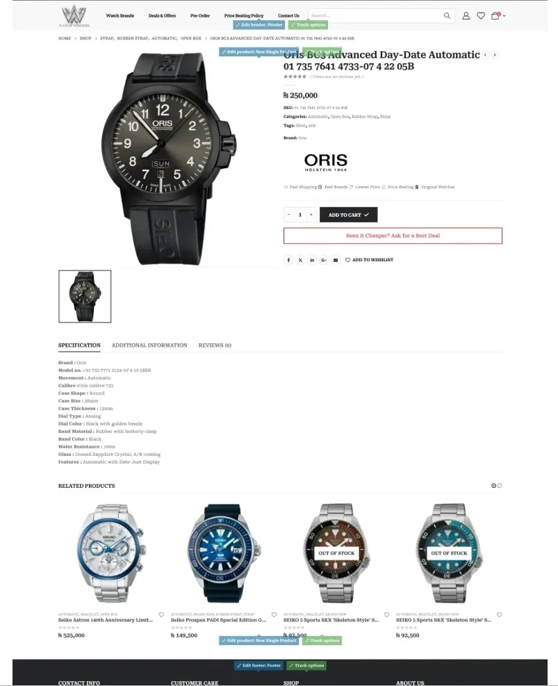
Not enough to decide on
A price and a spec table, for a purchase that can pass Rs.600,000.
- 04
Trust handled in private
Prices and stock were confirmed over WhatsApp, one buyer at a time.
Four rules for every screen
Written before any screen was designed, so every later decision could be checked against them.
- 01
Prove it before you sell it
Authenticity, warranty, insured delivery and returns sit next to the price on every product, not on a policy page nobody opens.
- 02
Keep WhatsApp close
In Pakistan the biggest orders close in conversation, so “Ask a specialist” sits right beside Add to Cart instead of being hidden.
- 03
Make 319 watches feel chosen
Three ways in, by brand, by use and by deal, so the catalogue feels like a collection rather than a database.
- 04
Quiet luxury
One gold on white, a serif display face and plenty of space. Red is used in one place only: when a sale clock is running.
Four steps from the homepage to the right watch
Each page narrows the choice, so visitors never face all 319 watches at once.
- 01 · Homepage
One collection up front, a way in, and a specialist to ask.
- 02 · Brand
Shop by brand: each house gets a card, then its own page.
- 03 · Catalogue
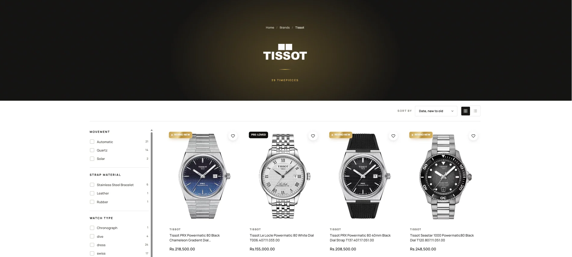
All Timepieces, with every filter counted before you click.
- 04 · Product
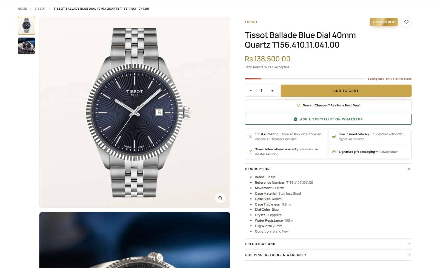
Price, stock, buy and the answer to “is it real?” in one view.
Answer every question before it’s asked
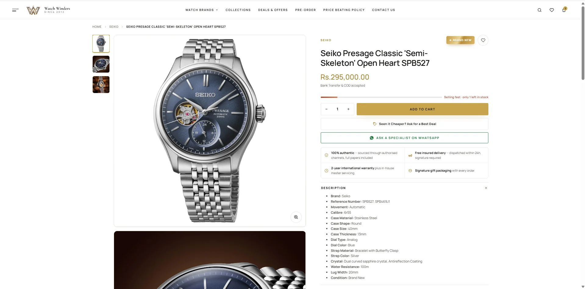
The page is ordered the way a buyer thinks: what does it cost, is it available, can I trust this, what exactly is it.
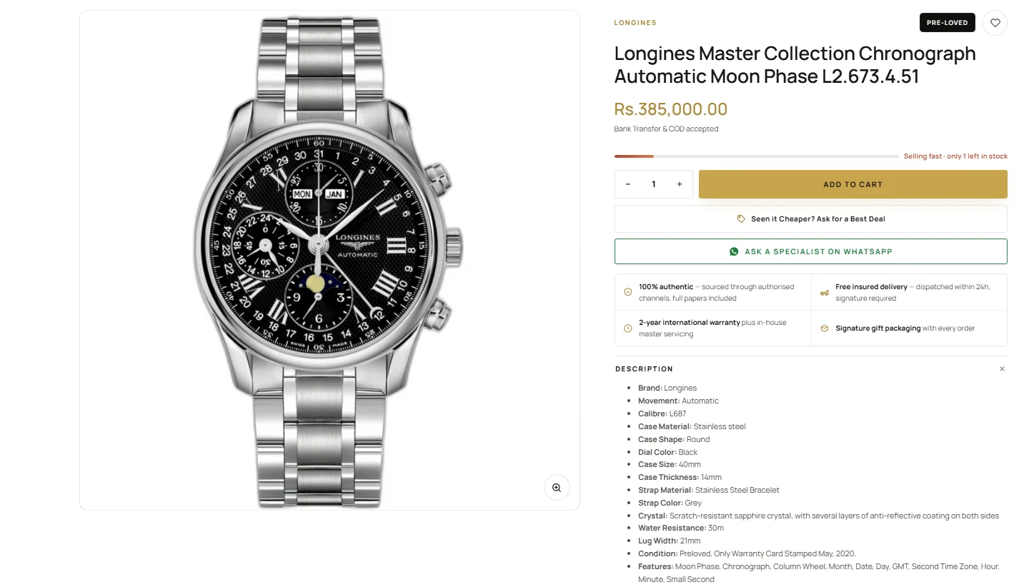 12345
12345- 1
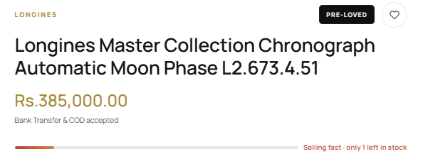
Price, then how to pay
Bank transfer and cash on delivery sit under the price, with a live stock bar, because availability is the next question.
- 2
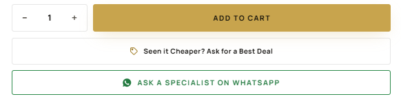
Second thoughts, answered on the spot
“Seen it cheaper? Ask for a best deal” sits under Add to Cart, where the price objection happens, with WhatsApp right below.
- 3
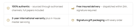
Four promises before the fold
Authenticity, insured delivery, warranty and packaging, above the specs instead of in the footer.
- 4
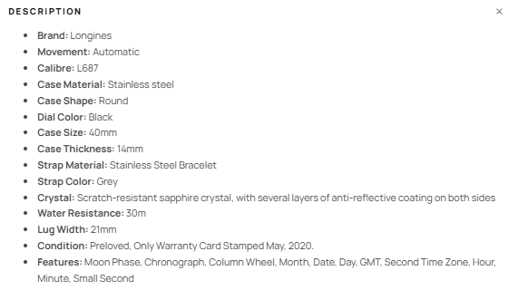
Specs a collector checks
Calibre, case size, water resistance, lug width and condition, in one scannable list.
- 5
The fine print stays one tap away
Specifications and shipping, returns & warranty fold away so the buy panel stays short.

When the buyer says “I’ve seen it cheaper”
Haggling used to happen in private messages, one buyer at a time. I moved it onto the page in three steps.
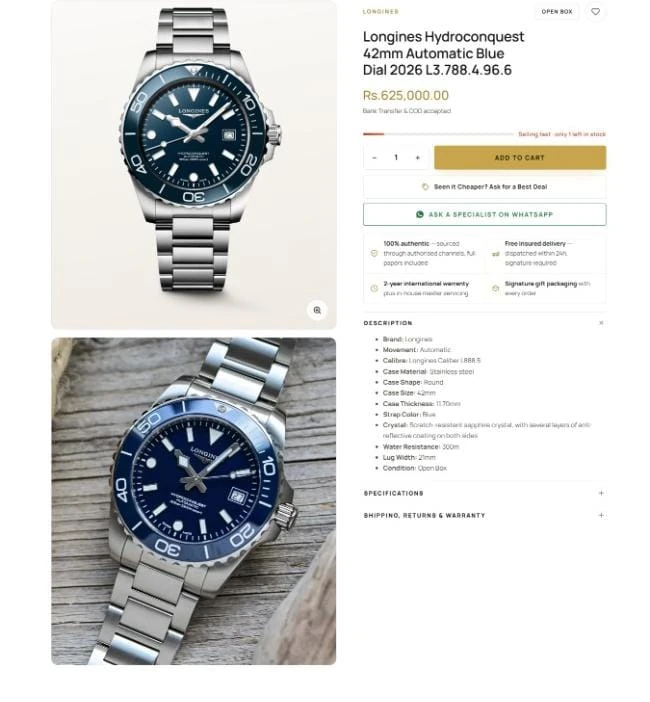
Second thoughts, answered in place
“Seen it cheaper? Ask for a best deal” sits directly under Add to Cart, at the exact moment the doubt happens.
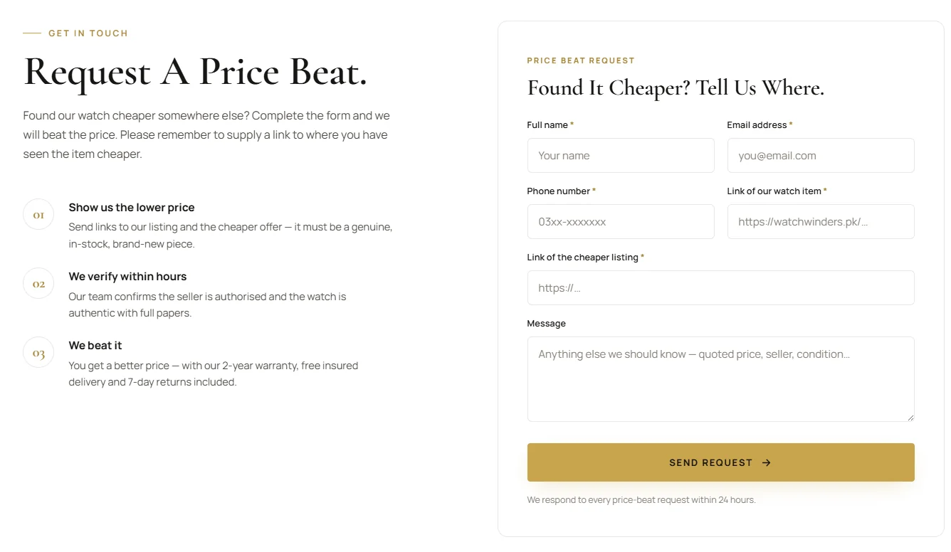
Haggling becomes a form
One short form that needs two links: ours, and the cheaper one. That single required field turns an open-ended negotiation into a request the store can actually check and answer.
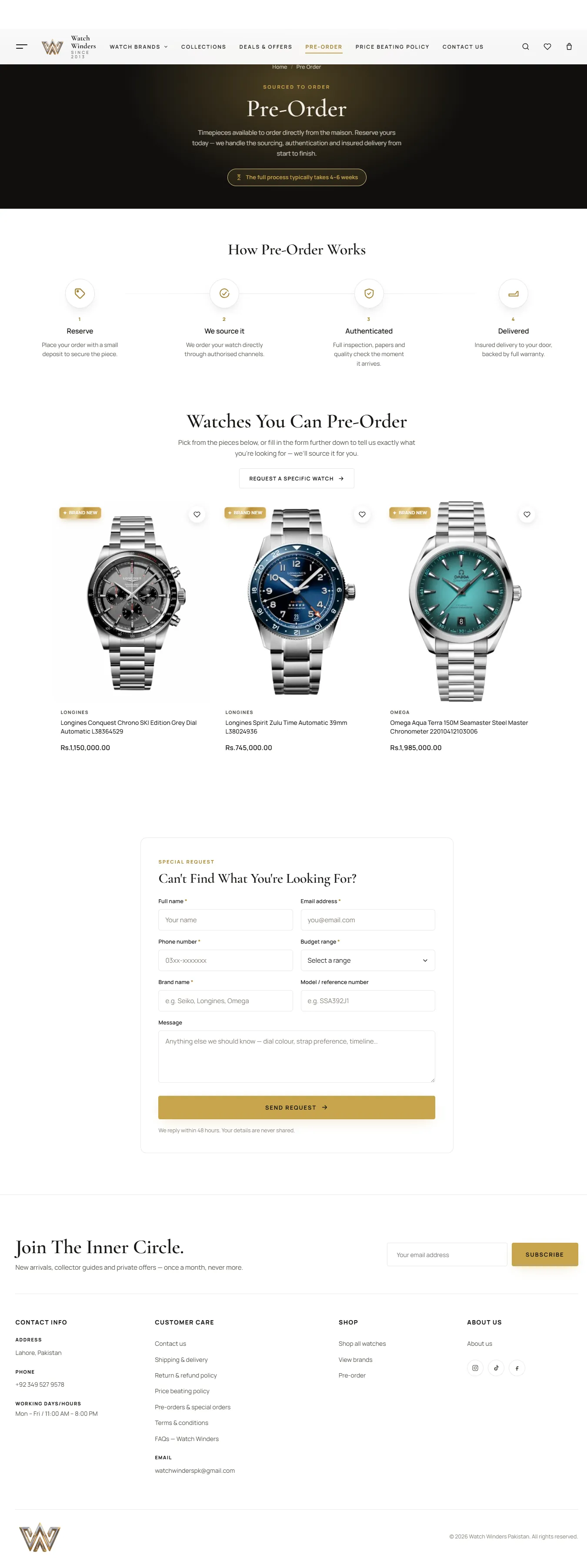
“Out of stock” becomes an order
If the store doesn’t have it, a four-step path takes over: reserve, source, authenticate, deliver. A budget field means the conversation starts with the right details.
Making 319 watches feel like a shop, not a warehouse
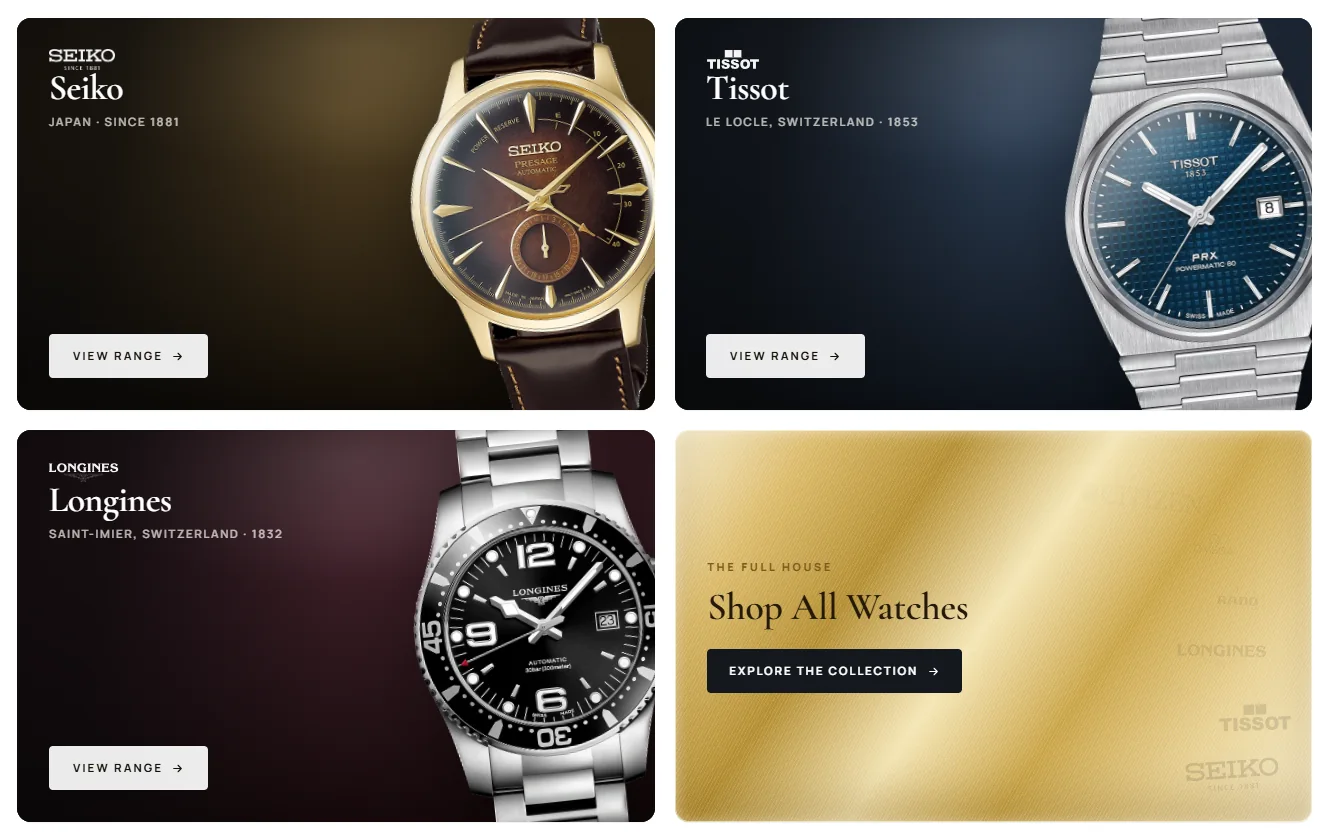
Shop by brand
Most buyers already know the brand they want. Each brand gets its own card and its own page, so they can go straight to it.
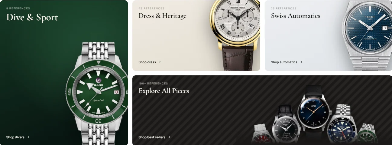
Shop by use
Some buyers know what the watch is for, like diving or a formal event, but not which model. Collections group watches by use: dive, dress, Swiss automatic, or everything.
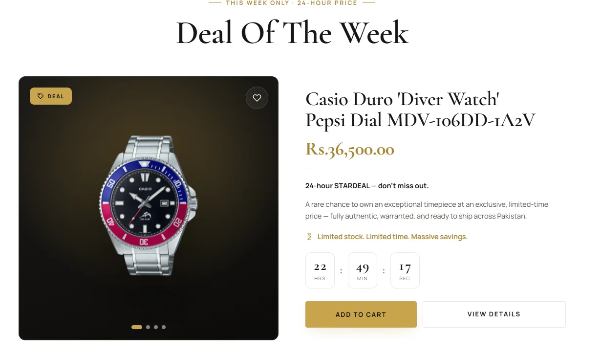
Shop by price
Some buyers are looking for a good price. One watch is on offer each week, with a countdown showing how long is left.
Anatomy of a product card
The part of the store buyers see most. Six small decisions, each answering a question before it’s asked.
The same 319 watches, a different store
The old store was a WordPress template. It could list watches, but it couldn’t answer the questions that make someone buy one.
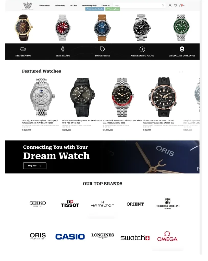
A stock carousel that could belong to any shop, replaced by one collection up front, a way in, and a specialist to ask.
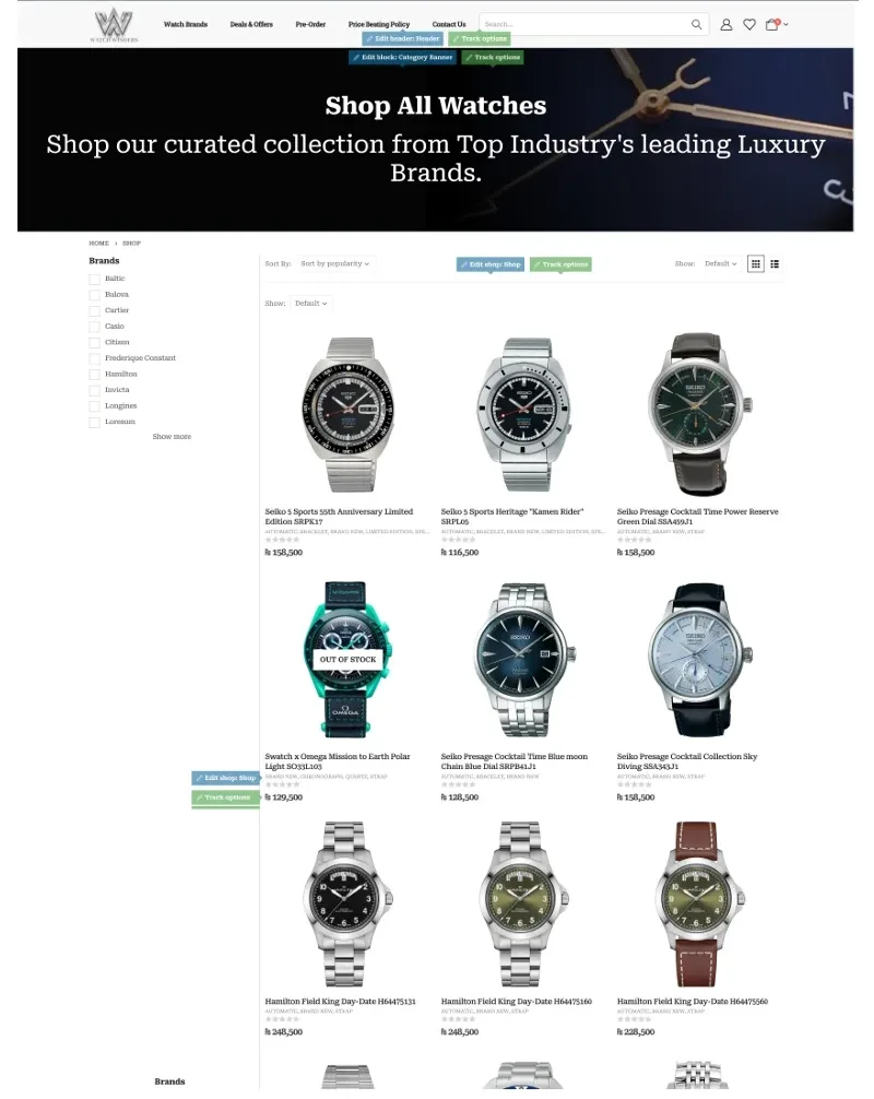
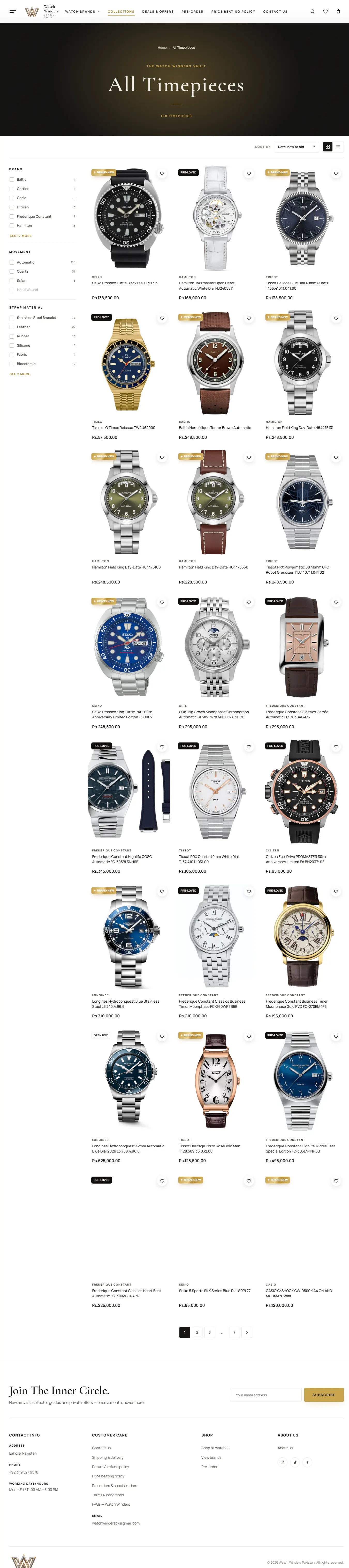
One flat grid with sold-out watches mixed in, replaced by filters that show a count before you click.
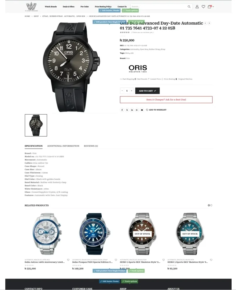
A price and a spec table, replaced by price, stock, buy, best deal and WhatsApp, then the four promises, in the order a buyer asks.
The finished store
Hover to scroll the full homepageWhat changed
Revenue grew 3x after launchAfter the redesign, WatchWinders saw revenue grow to nearly 3× its previous level.
The store isn’t selling the watch. It’s selling the proof.
With the price, condition and guarantees on the page, buyers no longer need to call before they buy.